
Welcome to WordPress. This is your first post. Edit or delete it, then start writing!
Apple’s HomePod delayed until next year
:no_upscale()/cdn.vox-cdn.com/uploads/chorus_image/image/57647653/v_8A0A9690.0.jpg)
Apple has delayed the release of its Homepod speaker until 2018. In a statement, Apple says that it needs more time to work on the HomePod. “We can’t wait for people to experience HomePod, Apple’s breakthrough wireless speaker for the home, but we need a little more time before it’s ready for our customers,” an Apple spokesperson said. “We’ll start shipping in the US, UK and Australia in early 2018.”
The speaker was originally set to be released in December. Priced at $349, the HomePod is slated to take on higher-end sound systems like Sonos, as well as smart assistants like the Amazon Echo and Google Home.
The cylindrical speaker features a seven-speaker array of tweeters, a four-inch subwoofer, and a six-microphone array, which puts it right on par spec-wise with the best speakers in its price range, but where it may fall short is Siri, which isn’t really in the same class as Alexa or Google Assistant. That challenge is likely why Apple’s focus at the launch of the HomePod back at WWDC in June was music first and smart features second.
It’s unclear exactly why Apple had to push back the release of the HomePod, but pulling out of the holiday rush isn’t something that any company takes lightly. With no firm release date — early 2018 is vague at best — it could be a while before we actually see the HomePod on sale.
Guide To Make Instagram Polls
As you all know that Instagram has come up with a new polling feature in it’s recent update launched on both ios and Android.

We held a poll on our Instagram account @thetechshow_official about whether you guys needed a guide to Instagram polls and 75% voted yes.
Adding polls is similar to any other sticker on Instagram: just drag and drop it onto your image in your story, and you’ll automatically be presented with the option to customize the question and choices. People viewing your story will be able to tap on a choice to vote, which will then show the overall results so far. To see the results for yourself, simply open up the viewers list for that image or video on your story, and it will show you total vote numbers, who voted, and what they chose.
/cdn.vox-cdn.com/uploads/chorus_asset/file/9381457/tumblr_inline_ox7vcaCwcH1qm4rc3_540.jpg)
Along with the new polling stickers, Instagram is also adding an eyedropper tool that allows you to take colors from your pictures to use on text and brushes, and an alignment tool (which is limited to iOS for now) that should help make sure text and stickers are properly centered on your pictures.
Guide To Get 280 Characters On Twitter
Twitter doubled the character limit of tweets to 280 in a surprise move two days ago, but not every Twitter user will be able to use the new limit just yet. Twitter is rolling out the long tweets feature to select accounts as a test, but Twitter user Prof9 has discovered a workaround to get longer tweets a little early. Here’s how to tweet with 280 characters instead of 140:
- Download Tampermonkey for your browser of choice (Chrome webstore link)
- Visit this Github repository, click the “raw” button, then tell tampermonkey to “install” the script (or copy and paste the code into a new script in Tampermonkey)
- Now visit twitter.com, make sure the script in running in Tampermonkey, then tweet away
It’s a simple workaround that will work automatically on Twitter.com every time you use the web client to tweet. Tampermonkey is a widely used userscript manager, and the javascript is a harmless workaround that simply bypasses the tweet button limit.
Share it with your friends if you found it useful.
Airtel deploys India’s first 5G capable technology

Bharti Airtel on Tuesday announced the deployment of India’s first state-of-the-art Massive Multiple-Input Multiple-Output (MIMO) technology which is a key enabler for 5G networks. Airtel is starting with the first round of deployment in Bangalore & Kolkata and will expand to other parts of the country soon.
Deployed as part of Airtel’s ongoing network transformation program, Project Leap, the MIMO technology will expand existing network capacity by five to seven times using the existing spectrum, thereby improving spectral efficiency, says the company.
Airtel has also claimed that customers will be able to experience two to three times superfast speeds on the existing 4G network. The data speeds will also be seamless and enable multiple users and multiple devices to work simultaneously without facing any congestion or experience issues especially at hotspot locations.
Massive MIMO is a key enabler and foundation for technology revolutions to come. It is a pre-5G technology that will make the network future ready for meeting the data demand coming from digital revolution and data explosion in India. Customers can enjoy these faster data speeds on their existing 4G mobile devices without any upgrades or plan change. Massive MIMO deployment uses green technology and thus helps reduce carbon footprint.
India is fast striding towards exponential and unprecedented data growth. Our latest deployment of Massive MIMO, will help us serve this demand and would also give an impetus to build a future ready network. The deployment gives us a strategic advantage to provide faster speeds and enhanced user experience for our customers, thereby translating into improved spectrum efficiency,” said Abhay Savargaonkar, director, Networks, Bharti Airtel.
Massive MIMO creates 3D beams both on horizontal and vertical planes towards users located within its coverage footprint. This helps in improving coverage and reducing interference across users in different beams, thereby improving signal quality (SINR) by 2-3dB. Serving multiple users by re-using same set of resource blocks (MU-MIMO) with improved signal quality helps in improving user experience, cell capacity and spectrum efficiency. Airtel recently also announced a strategic partnership with Korean telecommunications service provider SK Telecom to leverage its expertise to build the most advanced telecom network in India. Under this partnership, Airtel and SKT will also collaborate on an on-going basis towards jointly building and enabling an ecosystem for the introduction of evolved technology standards of 5G, Network Functions Virtualisation (NFV), Software-defined Networking (SDN) and Internet of Things (IoT) in the Indian context.
iOS 11 review
What to do after you upgrade

iOS 11 is available, officially, today. It’s coming to every iPhone and iPad made in the past few years, and chances are, you’re going to upgrade. When you install it on your iPhone, you’ll find that some things are very different than what you’re used to, but the core of how you get around and experience the OS will be the same. For example: the Control Center is wildly different and notifications have changed slightly, but you still have that comfortable (and comforting) grid of apps on the home screen. A lot is new, but not so much that you can’t recognize it.
The iPad is a different story. That’s where Apple has made the most radical changes to the way you open and manage your apps. Apple has introduced an app dock that’s available no matter what you’re doing with a quick swipe up, so you can get to your most-important apps quicker. It’s also changed the way that multitasking works, giving you more flexibility with split-screen apps. And you can now drag and drop content between apps, a feature that takes some finger Jiu Jitsu, but is remarkably powerful once you get used to it.
Apple is the best at pushing these software updates out, and they almost always go off without a hitch. This year, more than others, you’ll be getting features that will make you want to upgrade.
Features:-
/cdn.vox-cdn.com/uploads/chorus_asset/file/9278671/jbareham_170917_2000_0124.jpg)
Customize the Control Center
The first thing you’re going to want to dig into on iOS 11 is the all-new Control Center. It’s completely redesigned so that it sits on a single screen instead of on two or three swiping panels. It’s a little weird at first, with a wacky array of buttons and widgets. Some of them are simple button toggles, others are panels that you can force touch to expand for even more options.
Force touching the flashlight brings up a slider that lets you change its intensity. Force touching the networking panel brings up all your wireless radios and (praise be) a button to toggle your hot spot. One nice note: if you turn on airplane mode and then turn Bluetooth on again, that toggle “sticks.” So the next time you turn on airplane mode, your Bluetooth headphones won’t disconnect. Nice.
For the first time, Apple is providing a settings pane where you can customize which buttons do and don’t appear in Control Center, and you can reorder them as well. Apple is still not letting third-party developers put anything in here, but maybe next year it will.
In the meantime, there are a few panels that I’m really impressed with. There’s quick access to the Apple TV remote; if you have Control Center turned on for your lock screen, it might actually be more convenient than the real remote. I also think that the screen recording feature is super neat. It records a quick movie of whatever you’re doing on-screen. It seems like a feature custom-designed for reviewers and tech support, but it actually lets you do clever things like record gameplay or quickly grab a video clip.
I’m still mystified as to why Apple doesn’t put quick access to a Wi-Fi network selection screen somewhere in there, though. You still have to hunt through settings to change your Wi-Fi network or select a new one. I am glad to see that it’s easier to switch Bluetooth devices directly in Control Center, but I find the location (under the music widget) a little unintuitive.
Learn how notifications work
Apple and I have a very serious disagreement about notifications. I want them to be a place where I can quickly triage a ton of things. I want to get an overview of my day and take action on the stuff I care about while swiping away the stuff I don’t. I like to manage my notifications, and once they’re properly curated I get a ton of utility out of a notification pane. I can see what emails matter, I can respond to texts directly, I can dismiss stuff I don’t care about. I basically don’t even need the home screen.
Except doing all of that on iOS 11 feels like wading through chest-high mud.
/cdn.vox-cdn.com/uploads/chorus_asset/file/9272815/IMG_1831.PNG)
Apple’s philosophy is that I’m trying way too hard. Notifications are flying in so fast and at such volume that it’s not worth trying to live your life in that screen. Instead, you should just let them flow by, pay attention to one or two that you care about, and ignore the rest. If you really care, you can hit a little X button to clear them all out at the end of the day.
Apple has made a few concessions to my way of thinking since the first betas of iOS 11 came out. You can swipe away notifications now, and there’s also that X button at the very top that you can force press to clear all. But Apple still adamantly refuses to borrow a bunch of the notification innovations Android brought, such as grouping notifications from a single app together and putting higher-priority notifications at the top. I also find that managing notification settings requires way too much bouncing around within the Settings app.
But the most fascinating thing about notifications on iOS 11 is that the shade you pull down from the top is the same thing as your lock screen. They look and operate exactly the same: down to swipe over to your camera and to your widget screen. It’s one fewer conceptual “Zone” to have to think about, and once you get used to it you’ll wonder why it wasn’t always that way. Especially with the iPhone X, your phone is basically always going to be unlocked when it’s in your hand, so it makes sense that the “lock screen” and the “notification screen” are collapsed into one unit.
One clever thing that you won’t see unless you get an iPhone X: iOS 11 can default to hiding the content of your notifications on the screen, as before. But as soon as it recognizes your face, it will show their contents on your lock screen.
/cdn.vox-cdn.com/uploads/chorus_asset/file/9272829/files_verge.jpg)
Dig around the Files app
The next thing you should check out is the new Files app on iOS 11. It’s great. If you’re deep into the iCloud ecosystem, you’ll find all the files you’ve got stored on your other devices here — including what’s on your Mac’s desktop and documents folder.
That’s not that different from what was available before, but Apple is doing something new: giving top-level access to other, third-party cloud storage apps. Box, Dropbox, Google Drive, and OneDrive will all be available in the Files app. Right now, most of those just sort of link to their respective apps inside the Files app, but I hope and expect they’ll become “first class” citizens over time.
Whatever cloud service you use to store files (and at this point, you really should be using something), it’s worth stopping by the Files app to see if it’s working there. Chances are, it will be. The other reason to stop by the Files app is that it’s a good place to start playing around with another great iOS 11 feature: drag and drop.
Learn how to use drag and drop
On the iPhone, there are only two places where you can drag and drop stuff. The first is on the home screen, and it’s great. When you long-press (not force touch) an icon to go into “jiggly mode” to move stuff around, you can start dragging an icon — same as before. But now, you can tap other icons to add them to the “drag group,” which makes rearranging your home screen much easier.
The other place is within the Files app, where you can move multiple files between folders. Unfortunately, once you hit the home button, you’re all done dragging. Things are much more powerful on the iPad, where you can drag and drop a kajillion different things a kajillion different ways. You simply start dragging a file, photo, or a snippet of text on the iPad with one hand, but then use your other hand to start navigating the table to open the app you want to drag into.
More apps will need to gain support for drag and drop to make it truly useful on the iPad, but I’m a little disappointed that it’s not available on the iPhone. I get it: it already feels weird to be making these multi-app workflows happen on a big screen, so on a smaller screen it would probably feel like a mess.
Still, as I said in my preview, my favorite thing about iOS 11 is that it recognizes that its users are not so easily befuddled by complex user interfaces — and even if they are, the good ol’ way of doing things is still available.
Play with multitasking on the iPad
Multitasking on the iPhone is basically unchanged. Multitasking on the iPad is a near-revelatory experience — at least for people who have been trying to do Real Work on the tablet for years now.
You can do split screen as before, but there’s more freedom to set your “skinny” app on either side. When you do split screen, those two apps get “paired” so they appear together in the multitasking view.
It goes way deeper than that, though. You can drag apps up from the dock into either side of a split screen. You can open a third app up in a “slide over” view that just sort of hangs out over your other apps, but it can dismissed and called back with a swipe over from the side of the screen. You can convert those slide-over apps into properly split-screen apps by carefully dragging a handle at the top of the window.
It’s not as intuitive nor as simple nor as easy to manipulate as a traditional windowing system like you’ll get on a Mac, PC, or Chromebook. But it’s radically more powerful than what has ever been available on an iPad before. If it all feels too complex to you, you can mostly ignore it and just run one app at a time. But once you get a feel for it, you’ll find you can get much more done on an iPad than you could before.
Give Siri another try
The common knock on Siri is that people try it, it fails, and people stop trying it. Siri isn’t perfect, but it is much more capable than many give it credit for. Which is another way of saying: give it another shot, you might be surprised.
The big update you’ll notice right away is that Apple has tuned Siri so that its voice sounds much more natural and less computer-like. It’s just a little less grating to speak to your phone and have your phone speak back.
In terms of raw functionality, it’s hard to really pin specific features to iOS 11, since Apple updates Siri all the time on the server side. But two new things are worth trying. First, ask it to translate something for you. Siri can translate from English to Chinese, Spanish, French, German, or Italian at the start.
Second, you can dig into the General -> Accessibility settings and toggle a switch that lets you type to Siri instead of talking. Unfortunately, unlike Google, you can’t have both speech and typing available at the same time. But if you absolutely hate talking to your phone, you now have the option to switch Siri to a keyboard interface.
Take a screenshot
In the past couple years, screenshots have gone from a niche thing a few people do to something everybody does, and so Apple has significantly changed how they work to match how we actually use them.
Now, when you take a screenshot, it throws a little thumbnail down into the lower-lefthand corner. From there, you can swipe it away to save it. But if you tap it, you get an entirely new little mini app. It lets you crop it and annotate it with a suite of little markers and pens and such. If you’re doing it on an iPad, you can use the Apple Pencil for more precise annotations.
From there, you can save it, delete it, or share it directly using iOS’s standard share sheet.
Download some Augmented Reality apps
/cdn.vox-cdn.com/uploads/chorus_asset/file/9273525/The_Walking_Dead_Demo_Photo.png)
Apple’s augmented reality system for the iPhone promises to be a blast. You’ll be able to measure your room, sure, but you’ll also be able to put a T. rex in it and play some incredible games on your coffee table.
It’s all built off something called ARKit, Apple’s system for allowing developers to map digital objects into physical space on your screen. It’s not a full-on virtual reality headset on your face, but it’s remarkably good at taking some basic understanding of surfaces it can see through the camera and putting stuff on them through your phone’s screen.
It’s much too early to know whether AR apps are going to be more than a fun trick to play around with for a few minutes before you forget about it — though that’s been the way many AR and VR things have gone. But Apple’s famous for getting developers on board with really good apps, we expect the same will be true in iOS 11.
Turn Live Photos back on
If you’ve turned off Live Photos on your iPhone because you didn’t really see the point, turn them back on. For one thing, Apple’s new system for encoding photos and video means they’re going to take up a lot less of your iPhone’s storage going forward. This new feature probably won’t get very much attention, but it’s a big deal because you’re going to be less likely to run out of space than you were before.
But mainly, there are neat new features that make Live Photos worth another look. You can still see the tiny little video that’s taken when you take a Live Photo by force pressing on the image. But now, you can actually do stuff with that little clip. When you’re looking at a photo, you can swipe up on it to bring up new options for your Live Photo, including making it loop, bounce back and forth through time, or show a “long exposure.”
Sharing these little clips is still a bit of a hassle, but it’s better than it was before. They get saved as MOV files, which should work on most social networks. If you want a GIF, there’s always Google’s Motion Stills app.
And if you are buying one of the newer iPhones, you’ll want to make sure you check out the new Portrait Lighting feature on the iPhone 8 Plus and iPhone X.
/cdn.vox-cdn.com/uploads/chorus_asset/file/9278677/jbareham_170917_2000_0148.jpg)
/cdn.vox-cdn.com/uploads/chorus_asset/file/9278681/jbareham_170917_2000_0140.jpg)
Just look around at the new design
You’ve probably been doing this already, but take a minute to look at the new design you’ll see all over the place. Apps now have these giant headers that make it easier to get a sense of what you’re looking at, so they work better on larger screens. Like any design change, the differences in iOS 11 are polarizing, but I generally like it better than before. Apple made a huge shift way back in iOS 7, but with iOS 11 it feels like everything’s been a little softened.
If you really want to get a sense of the vibe that Apple is going for (and, therefore, what many of the other apps you use are going to look like soon), take a tour through the Apple News app and especially the newly redesigned App Store.
Apple has basically turned the App Store into a tiny little magazine for apps. There’s a “Today” tab for featuring apps, complete with little articles about them. Games are finally separated out from utility apps, so the top charts aren’t completely dominated by them. You’ll see how buttons are more clearly defined as buttons instead of bare words floating in a white expanse.
For better or worse (and mostly for the better), the App Store is the clearest indication of where Apple’s software design is headed, so it’s worth your time to poke around in it for a bit. Plus, you know, that’s where the apps are. You should download some.
WRAPPING UP
Apple’s real accomplishment with iOS 11 is evolving iOS to the point where the same basic OS works on iPads, iPhones, and iPhones with weirdly shaped screens. Heck, even the Apple TV technically is iOS underneath tvOS and it, too, is quite easy to understand.
Credits for Images:James Bareham / The Verge
iOS11 Brings complexity but its worth it
Google wades into Virtual Payments Territory
Yesterday, Google entered into virtual payment sector with its new app. It was unveiled at New Delhi, by Caeser Sengupta Google’s VP under the New Billion Users Project. It was also attended by Arun Jaitley, the Finance minister of India.
The name of app, ‘Tez’. As its name implies, the selling point of the app is its transaction speed and ease. At a nimble 7MB of size, it provides astonishing utility. This payment app is assisted by UPI which was started by NPCL. Registration requires your mobile number which acts as your VPA (Virtual Payment Address), this mobile has to be registered with your bank account if UPI transactions have to be done. Google has also partnered with Axis bank, ICICI bank nad State Bank of India for backend handling. The Google VP also talked about plans to integrate credit and debit card based transactions into its app in the future.
This app is available in both Android and iOS platforms, and is available in English and 7 other Indian languages (Marathi, Hindi, Bengali, Tamil, Telugu, Gujarati and Kannada).

Fig 1) Lock screen
For additional security, each time you open the app, you require a google pin which is created when you set up the app for the first time. However, it isnt required to carry out transactions.

Fig 2) Main Screen
If you want to conduct UPI based transactions, then you need your debit card details. Once they are filled in the app, two things are needed, your bank OTP and your UPI pin. The UPI pin is created when you register for the first time.

Fig 3) Transaction Screen
You can pay directly via your contacts (if the app is allowed access to contacts) or via a mobile number. It also supports cash based transactions which allows you to transfer money without exchanging mobile number. This method employs AQR (Audio QR) which encrypts the information between the payer and the payee, and also detects if a mobile terminal with Tez is nearby.

Fig 4) Cash mode
Google also introduced a launch offer, where if a user invites their friends, they both get Rs.51/- after their first transaction. The bonus limit is upto Rs.9000/- and the deadline is upto April 2018.
Anyways, the virtual payments sector gotten interesting with the entry of a huge corporation with Amazon and Whatsapp right next on the entrant list.
How to pick between the iPhone X and iPhone 8

Apple introduced three brand new iPhones on September 12th. Three! They include the iPhone 8 and 8 plus , which have faster processors and better cameras than last year’s iPhone 7 — and now you can charge them wirelessly. And then there’s a new iphone ‘, a $1,000 smartphone that Apple is basically trying to market as a gadget from the future that arrived a little early. It’s the first iPhone ever to have an OLED screen, and even better, that stunning display basically runs edge to edge. iPhone X comes with other radical changes like the removal of the home button in favor of a new feature Apple is calling Face ID, which scans your face to unlock your iPhone instead of the traditional Touch ID method still used on the iPhone 8 and 8 Plus.
So since there are three new iPhones arriving (almost) at once, you’ve probably been putting some thought into which is the best choice. For the purpose of this article, let’s go into it from the perspective of someone dead set on buying a new iPhone within the next couple months. You’ve ruled out the Pixel 2s and Note 8s of the world and have decided on Apple. Well, where do you go from there?
Why you might want to buy the iPhone 8:
- The iPhone 8 is the first iPhone to support wireless charging. Apple changed up the iPhone’s looks a bit this year with a glass back instead of just making the whole thing aluminum. So you’ll be able to plop the iPhone 8 down onto any compatible wireless charger and it’ll start juicing up. Many of the places where you’d find wireless chargers (like Starbucks and inside some newer cars) already support the same Qi technology as the iPhone, so it’ll just work.
- It has the same powerful A11 Bionic processor as the iPhone X. That sounds like something from a Mission: Impossible movie, but all you really need to know is that it’s the fastest chip that Apple has ever put in an iPhone — and the iPhone 7 already felt plenty fast. This new chip is also optimized for all the cool augmented reality tricks that you might’ve seen demos of. Soon, those will make their way to actual apps and games in the App Store. All recent iPhones can do AR, but Apple claims the 8 and X have been “optimized” for it.
- You get the same primary camera as what’s in both the iPhone 8 Plus and iPhone X. The 12-megapixel f/1.8 camera has a “larger and faster” sensor than the iPhone 7, says Apple, so if all you care about is having one good camera, this should be excellent. It’s got optical image stabilization and can record 4K video at 24, 30, or 60FPS — just like the other new phones.
- The display supports Apple’s True Tone feature, which adjusts the screen’s appearance and color temperature so that it always looks pleasant and less blue / harsh to your eyes in a variety of lighting environments.
- Unlike the iPhone 8 Plus, the regular iPhone 8 is still relatively easy to use in one hand. The iPhone X should be too, but it’s also hundreds of dollars more expensive.
- iPhone 7 cases still fit.
Why you might not:
- It’s only got the one rear camera, so you lose out on Apple’s Portrait mode and the new Portrait Lighting feature, which can change the lighting of a subject’s face in your shot.
- The 4.7-inch screen is smaller and lower-res (1334×750) than the iPhone 8 Plus and iPhone X. If you like things to look big on your screen and get lost in YouTube videos or your Instagram feed, the iPhone 8’s display might not be ideal.
- It has the smallest battery of the three new iPhones. Apple has promised users will experience “about the same” battery life as the iPhone 7, so you might find yourself buying a battery case.
The iPhone 8 costs $699 for the 64GB model or $849 for 256GB.
It comes in black, silver, or gold.
/cdn.vox-cdn.com/uploads/chorus_asset/file/9239803/Screen_Shot_2017_09_13_at_2.32.35_PM.png) Why you might want to buy the iPhone 8 Plus:
Why you might want to buy the iPhone 8 Plus:
- Aside from their different displays and dimensions/weight — and those are important — the iPhone 8 Plus offers pretty much every single major new feature that the pricier $1,000 iPhone X does. It’s got the processor. It’s got the wireless charging. It’s got dual cameras on the back and can do the same new Portrait Lighting effects as the iPhone X. The 5.5-inch LCD screen has True Tone.
- It has the familiarity of a home button and the versatility of Touch ID. Maybe you’re not convinced the iPhone X’s gestures and virtual home bar are really an upgrade. Plus, sometimes people just want to unlock their phone without having to look directly at it.
- It has the best battery life of all three new models.
- The 8 Plus’s display might be smaller diagonally than the iPhone X’s 5.8-inch screen, but it’s slightly wider because of their different aspect ratios. So some content — like your Instagram feed — will actually look larger on the Plus than on the X.
- iPhone 7 Plus cases still fit.
Why you might not:
- This thing feels like a “Plus” phone more than ever before when compared to the all-screen competition from Samsung, LG, Essential, and now Apple’s top-tier iPhone X. Other smartphone designs are getting more efficient, but the iPhone 8 Plus remains just as unwieldy as its three predecessors.
- Although the 5.5-inch 1080p LCD has superb color accuracy, it’s not going to be as vibrant or eye-catching as the iPhone X’s new OLED screen.
- It’s not really all that much cheaper than the iPhone X. If you get a 256GB iPhone 8 Plus, you’re already inching very close to that $1,000 mark.
The iPhone 8 Plus costs $799 for the 64GB model or $949 for 256GB.
It comes in black, silver, or gold.
/cdn.vox-cdn.com/uploads/chorus_asset/file/9239819/Screen_Shot_2017_09_13_at_2.37.00_PM.png)
Why you might want to buy the iPhone X:
/cdn.vox-cdn.com/uploads/chorus_asset/file/9239851/Screen_Shot_2017_09_13_at_2.39.05_PM.png)
- Visually, it’s Apple’s most impressive and futuristic iPhone design ever thanks to the 5.8-inch edge-to-edge OLED screen on the front and its stainless steel frame.
- It’s a big screen in a small overall form factor. The iPhone X measures a bit bigger than the iPhone 8, but it’s nowhere near the dimensions of the iPhone 8 Plus. It should be fairly comfortable to use in one hand. And in that hand is pretty much all display.
- The OLED screen has better contrast than the displays on iPhone 8 and 8 Plus, and it supports HDR video.
- You can unlock your phone with your face. If you like being the first to try Apple’s latest technology, Face ID is the biggest adjustment that iPhone users will have to make in years.
- Animoji and Portrait mode on the selfie camera. All of the sensors that make Face ID possible are also used for Animoji, which are moving emoji that mimic your facial expressions, and allow you to take portrait shots with blurred backgrounds (and Portrait Lighting) using the front-facing camera. Other iPhones can’t do that.
- The telephoto portrait lens on the iPhone X’s dual-camera has a better aperture than the iPhone 8 Plus. (f/2.4 vs. f/2.8).
- Both rear cameras have optical image stabilization, which should allow you to use the telephoto lens in darker conditions. On the iPhone 8 Plus, only the primary camera does.
Why you might not:
- It’s the most expensive iPhone ever.
- There’s no home button or Touch ID. Unlocking your phone requires looking directly at it. Every time. Unless you want to go old school with the passcode.
- Apple’s gestures for going back to the home screen and multitasking look somewhat awkward in early examples and demonstrations. At the most basic level, they’re definitely not as simple as just hitting a button with your thumb.
- The notch that houses the front-facing camera and other sensors. It’s just kind of there all the time, and Apple is embracing that. That should be perfectly fine in apps, but the notch is likely to obscure content from time to time. We’ve already seen that it sticks out into videos if you play them full-screen in landscape orientation. Are you the kind of person who can ignore that? I’m not sure I am.
- AppleCare+ is more expensive than for previous iPhones.
- It doesn’t come out until November.
The iPhone X costs $999 for the 64GB model or $1,149 for 256GB.
It comes in black or silver.
/cdn.vox-cdn.com/uploads/chorus_asset/file/9240915/Screen_Shot_2017_09_13_at_4.21.15_PM.png)
What do all three new iPhone models have in common?
- Same processor: A11 Bionic
- Same primary 12-megapixel camera
- Same 7-megapixel selfie camera
- Same video recording capabilities: 4K at 60, 30, and 24FPS. 1080p slo-mo at 240FPS
- Wireless charging
- “The hardest glass ever in a smartphone, front and back.”
- IP67 water and dust resistance
- Same maximum screen brightness
- 3D Touch
- Fast charging
- 64GB or 256GB storage options
So if you’re already set on getting one of these new iPhones, for me it would come down to the iPhone 8 Plus and iPhone X. The iPhone 8 is a little too small for my big hands, and I need a larger screen. Picking an ultimate winner between those two might come down to the wire before preorders for the former kick off early Friday morning. The iPhone X’s OLED screen is beautiful, but a home button and Touch ID still feel somewhat critical to me — at least until I’ve handled the X firsthand and can judge the gestures and face recognition myself. The release date of iPhone 8 / 8 Plus and iPhone X are far enough apart that if you start off with one of the 8s and come to regret it, you’ve still got enough time to return it and hold out for the X.
Shame that Apple didn’t just put the home button and Touch ID on the back of the iPhone X, though. That would’ve been just about perfect.
Mi Mix 2 – The Perfect Future Phone
Yesterday Xiaomi announced the Mi Mix 2. The original Mi Mix brought storm In the Innovative market and 2 is no brainier. While this time around they went with more practicality design and set a target to sell in many global markets including India.
 Mi Mix 2 rectifies some of the issues of the original and drops the concept tag. This new model is smaller and more approachable than the first Mix, and it will eventually be available everywhere Xiaomi sells phones (which, sadly, does not yet include the US). It will first be available in China, with prices ranging from from 3299 yuan (about $500) to 4699 yuan ($720).

| DISPLAY | |
|---|---|
| Type | IPS LCD capacitive touchscreen, 16M colors |
| Size | 5.99 inches (~80.8% screen-to-body ratio) |
| Resolution | 1080 x 2160 pixels (~403 ppi pixel density) |
| Multitouch | Yes |
| – MIUI 9 | |
| PLATFORM | |
|---|---|
| OS | Android 7.1 (Nougat) |
| Chipset | Qualcomm MSM8998 Snapdragon 835 |
| CPU | Octa-core (4×2.45 GHz Kryo & 4×1.9 GHz Kryo) |
| GPU | Adreno 540 |
| MEMORY | |
|---|---|
| Card slot | No |
| Internal | 64/128/256 GB, 6 GB RAM or 128 GB, 8 GB RAM |
| CAMERA | |
|---|---|
| Primary | 12 MP, phase detection autofocus, OIS (4-axis), dual-LED (dual tone) flash |
| Features | 1/2.9″ sensor size, 1.25 µm pixel size, geo-tagging, touch focus, face detection, HDR, panorama |
| Video | 2160p@30fps, 1080p@30fps, 720p@120fps |
| Secondary | 5 MP |
| SOUND | |
|---|---|
| Alert types | Vibration; MP3, WAV ringtones |
| Loudspeaker | Yes |
| 3.5mm jack | No |
| – Active noise cancellation with dedicated mic | |
| COMMS | |
|---|---|
| WLAN | Wi-Fi 802.11 a/b/g/n/ac, dual-band, WiFi Direct, hotspot |
| Bluetooth | 5.0, A2DP, LE |
| GPS | Yes, with A-GPS, GLONASS, BDS |
| NFC | Yes |
| Radio | No |
| USB | Type-C 1.0 reversible connector
|
The display itself is a bright and vibrant LCD panel with wide color gamut and 2,160 x 1,080 pixels of resolution. It has rounded corners and just the scantest of frames above and on the sides of it. The border below the screen is larger, as it houses the front camera (which is now better disguised thanks to a “super black” lens coating), a notification light, and other electronics necessary to power the panel. The screen itself isn’t as vibrant, bright, or hi-res as Samsung’s OLED displays, but it’s still very nice to look at and perfectly fine in every day use.
Along the top of the phone is a standard earpiece speaker tucked into a tiny slit — Xiaomi has ditched the fancy but ultimately worse piezoelectric speaker from the first Mi Mix. The Mi Mix 2 does not have a standard proximity sensor to turn off the screen when you hold it up to your ear for a call, but uses an ultrasonic system to accomplish the same effect.

Mi Mix 2 is overall a great Flagship for the given price. It’s one of its kind phone build with premium materials and killer specs at killer price. Xiaomi’s tradition – “Technology is not Expensive” seems to grow and capture the growing market. While we in India are excited to get the hands on this beautiful phone.
Source – The Verge, Gsmarena
Meet Mi A1 – The Best Android One Device in the Market
Yesterday Xiaomi announced Mi A1 in India. This was the global launch of the re-branded Mi 5x which will be shipped with Pure stock android directly from google. Yes they partnered with Google to bring back the glory of android one project. They call it – Created by Mi and Powered by Google.

Like the near-identical Mi 5X announced for China recently, the Mi A1 has Qualcomm’s increasingly ubiquitous Snapdragon 625 processor — which we’ve found to strike a great balance between performance and battery life — and a fairly standard 3080mAh battery. The phone charges over USB-C, unlike Xiaomi’s more budget-orientated offerings, and the company is even including a custom 380V charger that it says is designed to handle India’s frequent power spikes.

The handset has a dual rear camera setup 12MP rear cameras and a 5MP front-facing shooter. One of the rear cameras is a wide-angle lens while the other is a telephoto lens. The smartphone’s bokeh effect is called the ‘Stereo Mode’ and the images captured in this mode left a lot to be desired.
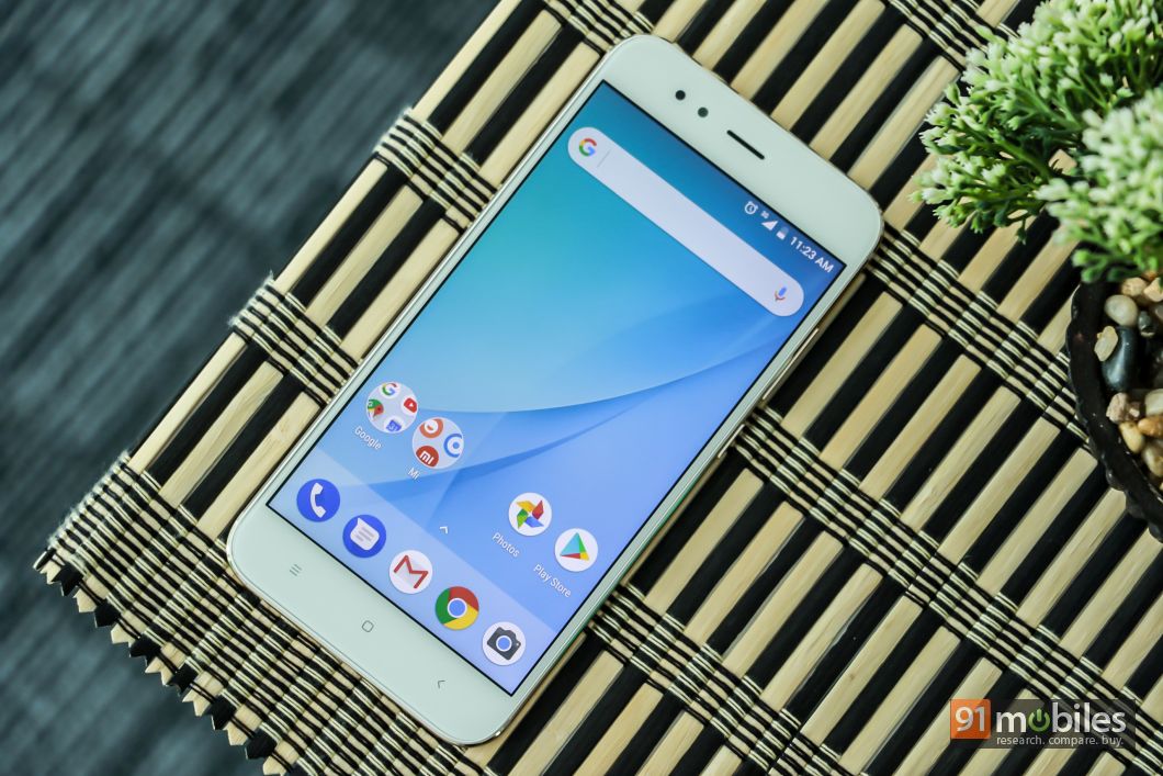
But the Mi A1’s most distinctive feature is its software: it runs stock Android, not Xiaomi’s own MIUI layer, and is part of Google’s Android One program. Android One launched three years ago with a focus on India as Google aimed to codify the Android experience for low-end smartphones. It hasn’t been a huge success, but Google undoubtedly wants to expand the program to a wider range of products to ensure that people continue to have access to the latest versions of its software and services.
| DISPLAY | Type | LTPS IPS LCD capacitive touchscreen, 16M colors |
|---|---|---|
| Size | 5.5 inches (~70.1% screen-to-body ratio) | |
| Resolution | 1080 x 1920 pixels (~403 ppi pixel density) | |
| Multitouch | Yes | |
| Protection | Corning Gorilla Glass (unspecified version) |
| PLATFORM | OS | Android 7.1.2 (Nougat), planned upgrade to Android 8.0 (Oreo) |
|---|---|---|
| Chipset | Qualcomm MSM8953 Snapdragon 625 | |
| CPU | Octa-core 2.0 GHz Cortex-A53 | |
| GPU | Adreno 506 |
| MEMORY | Card slot | microSD, up to 128 GB (uses SIM 2 slot) |
|---|---|---|
| Internal | 64 GB, 4 GB RAM |
| CAMERA | Primary | Dual 12 MP (26mm, f/2.2; 50mm, f/2.6), phase detection autofocus, 2x optical zoom, dual-LED (dual tone) flash |
|---|---|---|
| Features | 1.25 µm/ 1.0 µm pixel size, geo-tagging, touch focus, face detection, HDR, panorama | |
| Video | 2160p@30fps, 720p@120fps | |
| Secondary | 5 MP, 1080p |
| SOUND | Alert types | Vibration; MP3, WAV ringtones |
|---|---|---|
| Loudspeaker | Yes | |
| 3.5mm jack | Yes | |
| – Active noise cancellation with dedicated mic |
| COMMS | WLAN | Wi-Fi 802.11 a/b/g/n/ac, dual-band, WiFi Direct, hotspot |
|---|---|---|
| Bluetooth | 4.2, A2DP, LE | |
| GPS | Yes, with A-GPS, GLONASS, BDS | |
| Infrared port | Yes | |
| Radio | FM radio | |
| USB | 2.0, Type-C 1.0 reversible connector |
To that end, the Mi A1 will get Android Oreo by the end of the year, and Xiaomi says it’ll be “one of the first” phones to get Android P — which we haven’t heard anything about — in 2018.

Mi A1 is the Perfect Smartphone. It is DREAM come true for Google Fans and Mi Fans. Looks like a flagship and runs stock android with budget internals and price.
Nailed it Xiaomi !!!
Source – The Verge, Gsmarena, Gadgetsnow